Principals of Design


These 3 images show unity and diversity. The top images shows the mostly flat landscape with on the left it being green, and the right it being more orange with some brown, and a really saturated orange canyon in the middle. The second shows the dry Nevada desert, the somewhat snowy Sierra's, and the lush mountains right before. The third shows a bunch of bikes, all similar but a little bit different in color, model, etc..
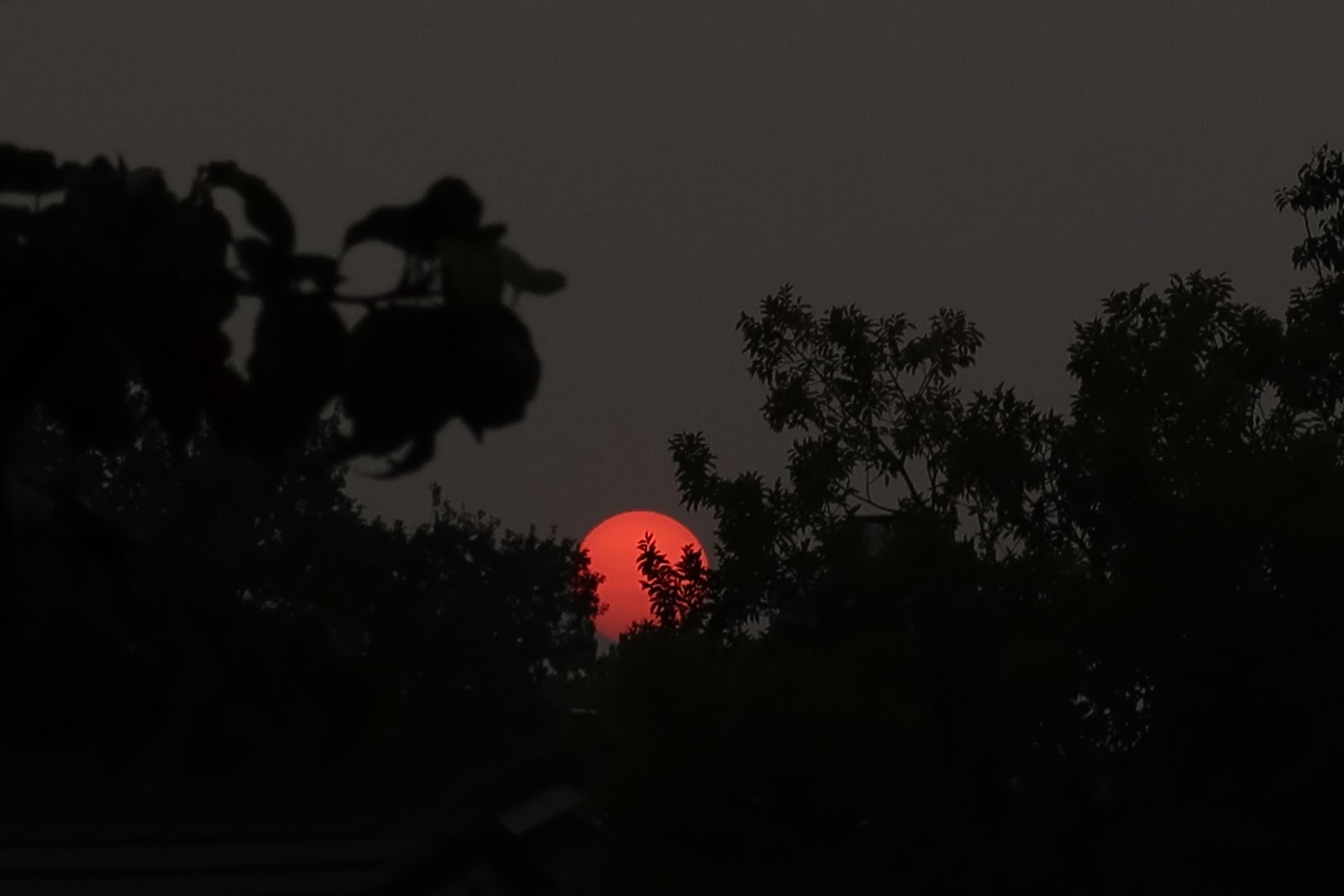

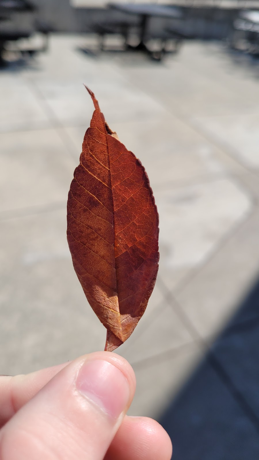
These 3 images show emphasis. The first image shows the trees almost holding the red sun up on the very gray sky, the black and grey emphasizing the saturated red ball of fire. The second one shows the sun with bright yellow and orange circle gradient surrounding it, with the rest of the image dark emphasizing the sun. The third image shows a red leaf in the center of the image, the light grey blurred background emphasizing the leaf out more.


Comments
Post a Comment